Data Visualizations: Plot #1

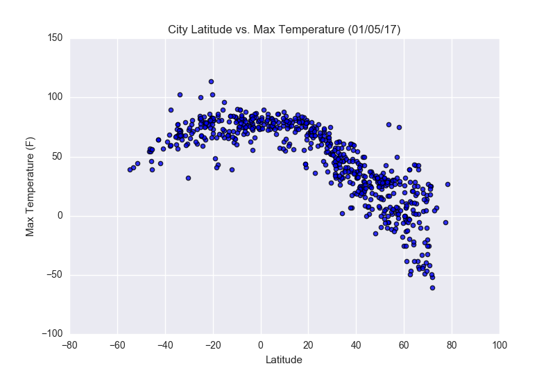
This chart plots Latitude of a city on the X-axis and Max temperature for that city on the Y axis. We can see a strong correlation that in the data. It appears that cities nearer to the equator (latitude zero) tend to have much higher maximum temperatures. Also of note, there are many more data points above zero than below. From this data we can infer (and confirm with subsequent research) that there is more inhabited land (and thus more major cities with temperature readings) above the equator than below it.


